Various items to preview at your leisure. Most of these items were sent in emails.
(Click to view) “Jess-Colorful-Pets.pdf” [PLEASE DOWNLOAD IF YOU WANT, and of course, share if desired.
(Click to view ((Same as sent via email)) “Helpful to gauge for simple tracing with Jess.pdf”
Examples of Contrast (Q&A). NOT critique! When I looked over all the painted examples I’d captured, the value/contrast is GREAT! Sometimes, I forget there is a light and dark side. I think it is only when a large/bold area of Opera is used that the value might be minorly different. (When I looked for examples AFTER Q&A, I was kinda embarrassed for asking.)
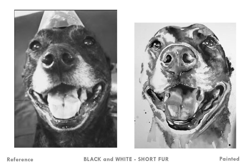
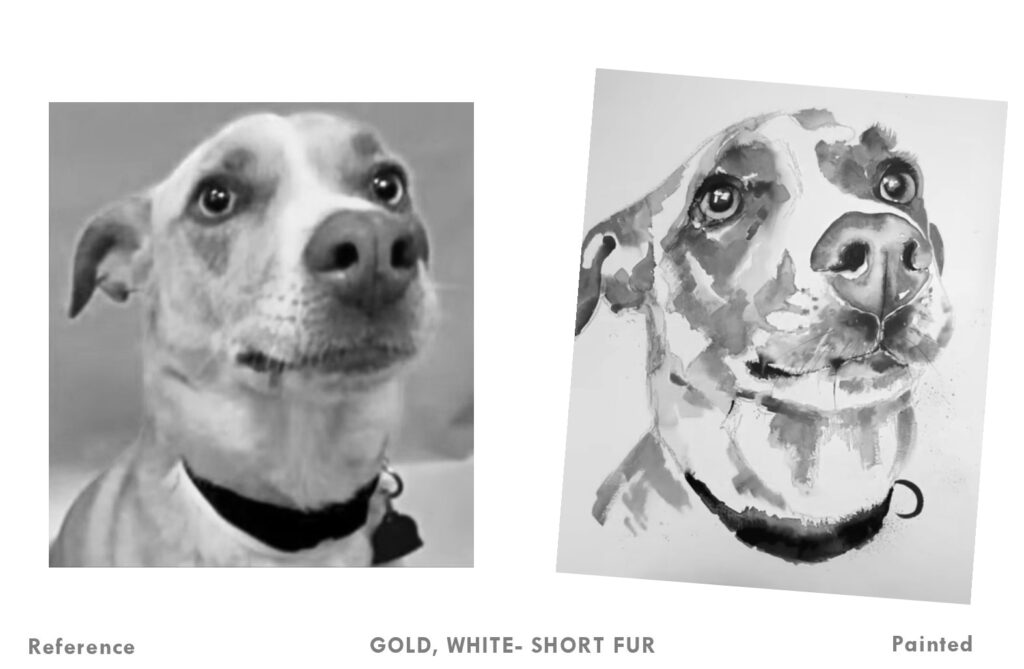
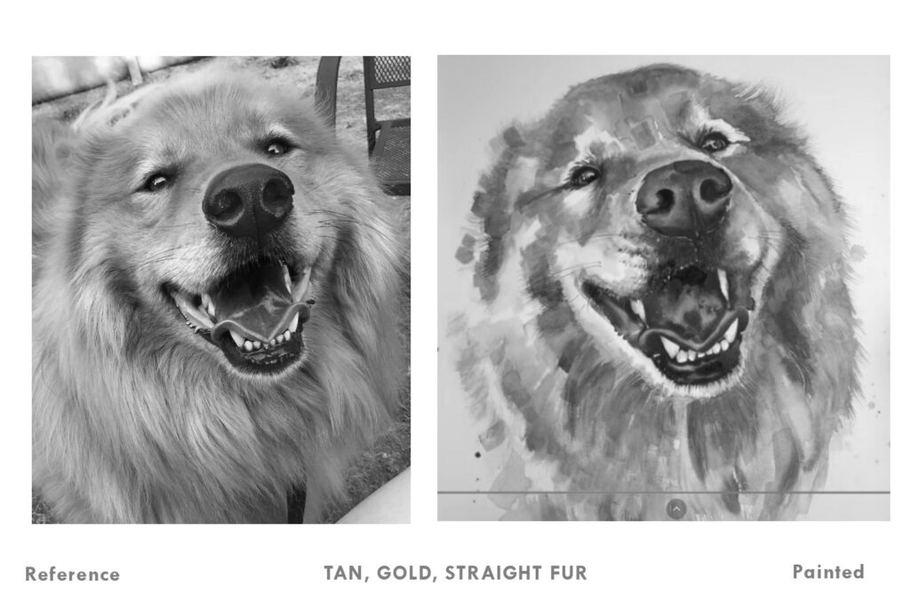
[ALL OF THESE paintings need to be better photographed or scanned.]
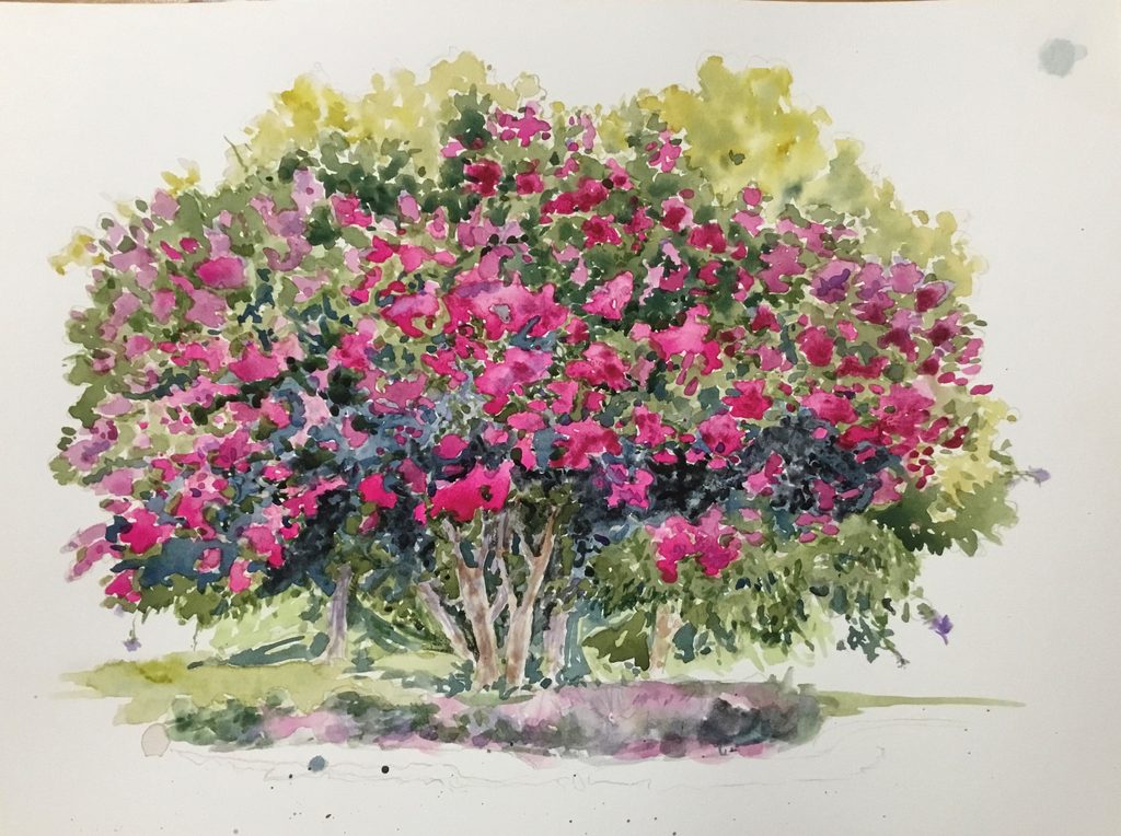
[This was a banner year for Crepe Myrtle trees in SC! They obviously LOVE extreme heat and humidity. This one lives at my Post Office, and I may gift it to them.]
This is the 12″ x 9″ painting that I referenced RE: losing small detail/ink after waxing. From the start I used scribbles as an aide to enhance values.
Turned out to not be a great plan, but I learned a lot. In fact, across the board I can see/feel what I am learning from you Jess. I’m not ever ‘blowing smoke’, but sincere in remarking on your unique techniques and generous/authentic teaching style.
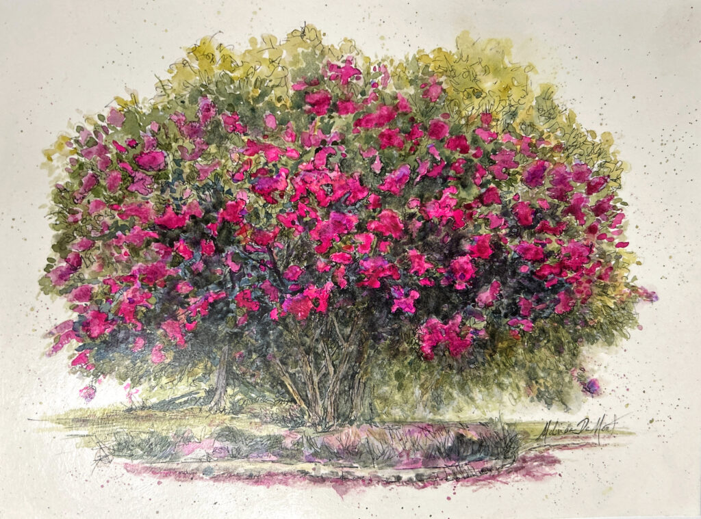
The initial foundation before (planned) ink sketching was much fresher than the final art:
This is a new attempt at 15″ x 11″ Meeden- *animal portrait. It did not go too smoothly, with some fairly major, reasonably successful corrections. i.e. (I painted white over iris’ because they got so dark.)
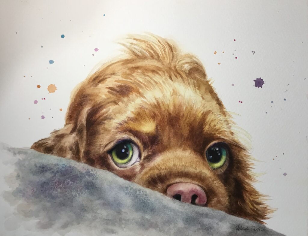
*NOTE: I think I found a (transitional) “bridge”- 1- Painting ‘any pet’, with no pressure of time/success/match. (This subject was on a YT funny animal show.)
2- (Not here demonstrated): If I just use an initial loose tracing of the reference, and ‘paint freely’- even to the point of graphic/abstract design, etc.; it sets me FREE(er.) As opposed to letting challenges STOP me from painting, i.e. my environment, eyesight (love to paint without my specs); constantly looking back & forth at ref. photo ((allows drying; aggravates Vertigo; losing place, etc.)) I am still learning/employing your techniques, and importantly, ENJOYING the process. I am determined to ‘break through’ to a point of consistent desired results.
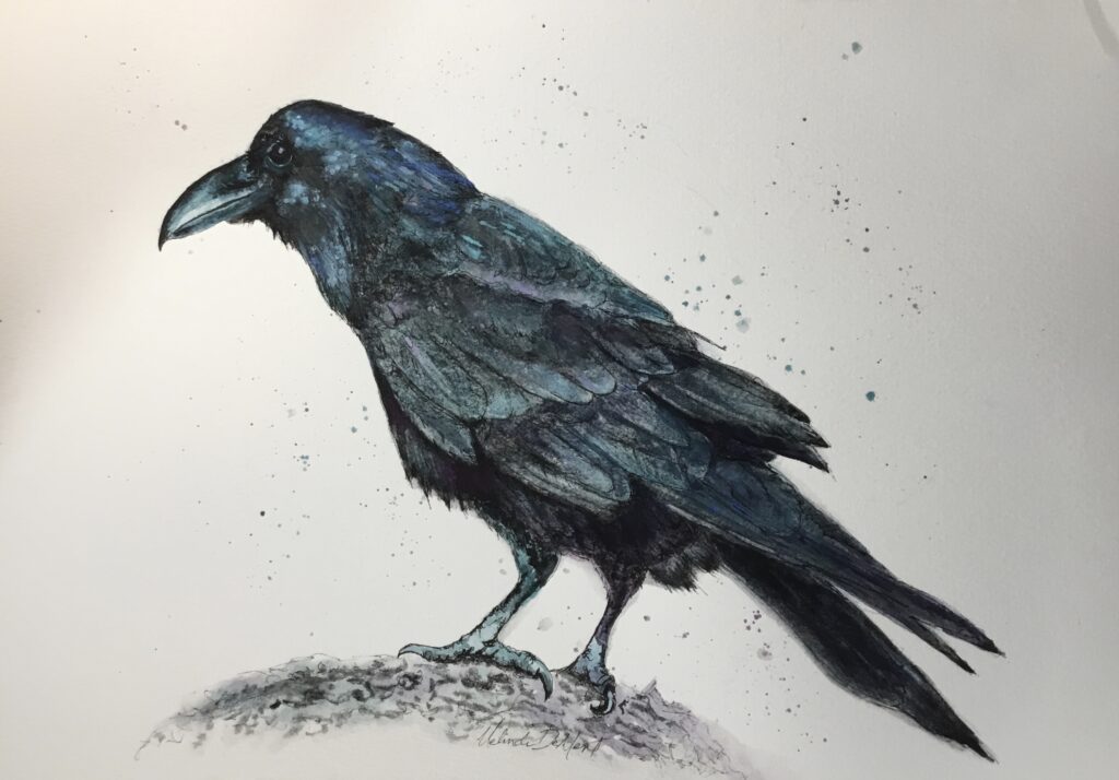
Finally, I’d wanted to explore (beyond some fun “Tests”) with Lunar Black features. I thought the raven would be ideal.
I was a bit surprised that on (15″ x 11″) Meeden cold press, everything seems to sink in immediately (different from the carefree tests on same paper), for a resulting ‘soft/fuzzy’ raven. I think you actually mentioned something like that on a video, the sink in factor.
Additional to inked lines, I used a couple of chalk markers to add some punch. They are kinda cool, but bossy.
Though the line/sketch is important on this one, I’m ready to wax as I think it will pull together in a better way.
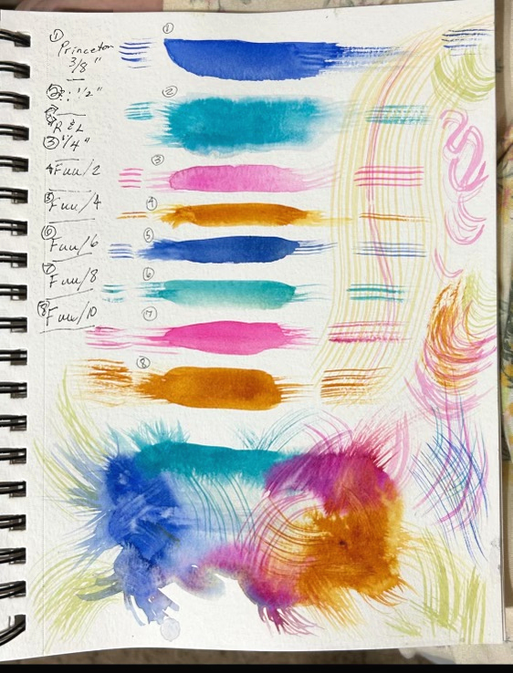
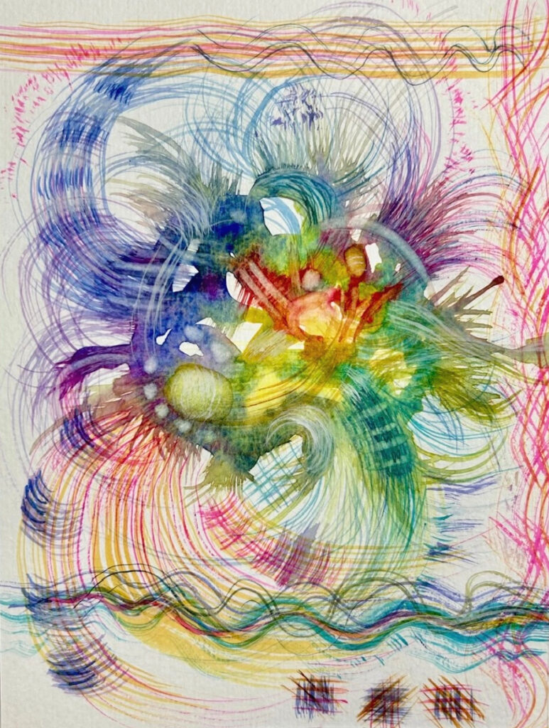
A while back I tested some new grainer brushes and sent via email. They have amazing potential. I’ll pop them in here:
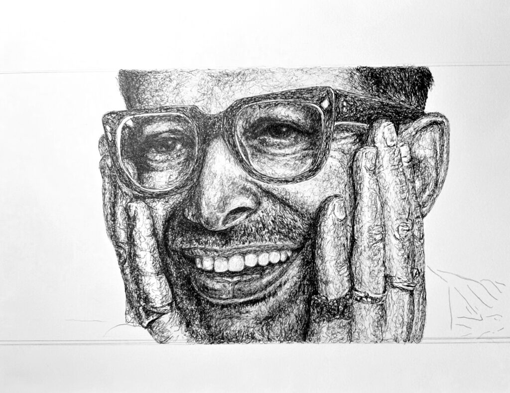
Lastly for now, I ruined a pen scribble sketch (I love doing that, a meditation for me with little mind… my hands seem to ‘know what to do.’ I took a pic after I knew the eyes were quite inaccurate and was at a crossroads. I had little hope for correction techniques, but tried some white to cover and lost all hope. Though the corrections are fairly obvious working upside/down; I don’t think it could ever look fresh or moderately undetected.
(That said, have you tried correcting with watercolor ground? I may try that before tossing it.)
Thanks for all you do, Jess! It is fun to share with you.